
The Impact of Color on Building Material Selection
Color in architecture color plays a significant role in the selection of building materials, impacting both their aesthetic appeal and functionality. It is a visual language that influences our emotions and perception of spaces. When choosing building materials for interior and exterior applications, careful consideration must be given to the color palette in order to create the desired ambiance and support the function of the space.
Key Takeaways:
- Color has a profound impact on building material selection, affecting both aesthetics and functionality.
- The choice of color palette in building materials can create the right atmosphere and support the purpose of the space.
- Color evokes emotions and influences our perception of architectural spaces.
- Proper color consistency throughout construction and fabrication is essential to avoid material replacement and customer dissatisfaction.
- Spectrophotometers are commonly used to measure and monitor color consistency in building materials.
The Psychological Role of Color in Architecture
Color in architecture is not just about aesthetics; it plays a significant role in shaping our psychological and emotional responses to the built environment. Numerous studies have shown that different colors can elicit distinct emotions and influence our mood and behavior. Understanding the psychological impact of color is crucial for architects and designers when selecting building materials.
One famous example is red, which symbolizes passion, energy, and excitement. In architecture, red may be lively and vibrant. However, blue is relaxing and tranquil, making it a favorite option for bedrooms and wellness facilities.
Each color has its own unique psychological associations. Yellow symbolizes happiness and optimism, whereas green symbolizes nature and balance. Architects can use these emotional connections to build rooms that evoke certain sentiments and meet inhabitant needs.
It is essential for architects and designers to consider color psychology when selecting building materials. By understanding how different colors can impact our emotions and perceptions, they can create spaces that are not only visually appealing but also supportive of the intended function and atmosphere.
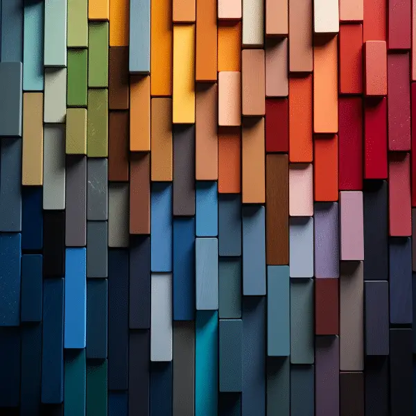
The Importance of Color Consistency in Building Materials
When choosing building materials, color consistency is crucial. Maintaining consistent color throughout construction is vital to achieve the desired visual impact and avoid potential issues down the line. Whether it’s glass, bricks, tiles, or shingles, keeping color uniformity ensures that the final product meets customers’ expectations and avoids the need for replacements.
For building material manufacturers, monitoring color consistency during fabrication is essential. It not only upholds their reputation but also plays a significant role in customer satisfaction. Deviations in color can lead to disappointment and frustration among buyers, potentially affecting the success of the business. That’s why many manufacturers rely on spectrophotometers, precise color measurement devices, to ensure that the materials they produce meet the desired color specifications every time.
The Importance of Color Consistency in Building Materials
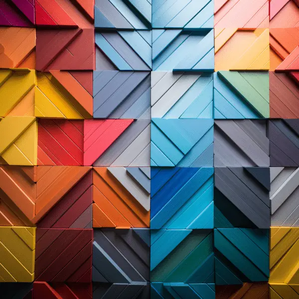
Consistency in color is particularly important when working with materials that have a wide variety of colors, patterns, and textures. Take tiles, for example. Tiles come in various shades and designs, and using inconsistent colors can result in a disjointed and unappealing appearance. By focusing on color consistency, builders and manufacturers can create harmonious spaces and minimize the need for costly replacements.
Overall, color consistency in building materials is vital for both aesthetic and practical reasons. It ensures that the desired effect is achieved, upholds a company’s reputation, and ultimately leads to satisfied customers. By using tools like spectrophotometers to monitor color consistency, builders and manufacturers can confidently deliver high-quality products that meet consumers’ expectations.
| Benefits of Color Consistency in Building Materials | Importance |
|---|---|
| Enhances visual appeal and overall aesthetics of the space | High |
| Ensures customer satisfaction and avoids disappointment | High |
| Minimizes the need for costly material replacements | Medium |
| Upholds the reputation of building material manufacturers | Medium |
| Creates a cohesive and visually pleasing environment | High |
The Emotional Associations of Colors in Architecture
Colors have a significant impact on our emotions and can greatly influence the perception and experience of architectural spaces. Different colors evoke different emotional associations, creating unique atmospheres that shape the overall feel of a building or interior environment.
Red is a color that often symbolizes passion, excitement, and energy. It can be used to create a sense of vibrancy and intensity in architectural spaces. However, it is important to use red judiciously, as excessive use can evoke feelings of aggression or overwhelm the senses.
Conversely, blue is tranquil and quiet. Architectural settings employ it to generate calm and security. Blue elements, such as furniture or lighting, can enhance the overall atmosphere and contribute to a more peaceful environment.
“Colors are the smiles of nature.” – Leigh Hunt
Yellow is a color that exudes joy, happiness, and optimism.Architectural areas use it to generate a cheery and pleasant atmosphere. Yellow is excellent for settings that need brightness and energy since it brightens fast.
Green represents nature, growth, and harmony. It symbolizes calm and serenity. Greenery in architecture may calm and rejuvenate. The atmosphere can be enhanced with natural and bright greens.
Orange is a color that combines the energy of red and the warmth of yellow.Creative and enthusiastic are connected with it. Orange can generate a warm mood in architecture, making it ideal for places that foster interaction and inspiration.
Emotional Associations of Colors in Architecture
To summarize, colors in architecture have the power to evoke a wide range of emotions and create different moods within a space. From the passion of red to the serenity of blue, each color brings its own unique energy and character. By understanding the emotional associations of colors, architects and designers can strategically use color to enhance the overall experience and atmosphere of a building or interior space.
| Color | Emotional Association |
|---|---|
| Red | Passion, excitement, vibrancy |
| Blue | Calming, serene, peaceful |
| Yellow | Joy, happiness, optimism |
| Green | Tranquility, relaxation, harmony |
| Orange | Creativity, enthusiasm, warmth |
The Use of Red in Architectural Spaces
Red is a powerful color that can bring a range of emotions and associations to architectural spaces. When used strategically, red can create a bold and attention-grabbing impact. Darker shades of red, such as maroon, can evoke a sultry and enticing ambiance, perfect for creating a sense of luxury in areas like hotel lobbies or exclusive restaurants. However, bright and colorful reds like neon red can create a pleasant and dynamic ambiance, making them ideal for cafes and community centers that stimulate social contact.
One of the key factors to consider when using red in architectural spaces is balance. While red can be eye-catching and stimulating, excessive use of this color may feel overpowering and overwhelming. To avoid this, it is essential to incorporate red as an accent color or in combination with other hues. For example, using red to draw attention to specific objects or architectural elements can create focal points and guide the eye through a space.
“Red is the color of blood and fire. It is associated with strength, power, and passion. When used thoughtfully, red can create a sense of excitement and energy in architectural spaces.”
The Emotional Associations of Red in Architecture
Red is connected with strong emotions and can evoke several psychological responses. It often evokes passion, love, and danger. The intense energy of red can increase heart rate and adrenaline levels, making it a stimulating color choice. However, it is important to consider the context and purpose of a space when using red, as it may not always be suitable for environments that require calmness or relaxation.
| Emotional Associations of Red in Architecture | |
|---|---|
| Passion | Excitement |
| Energy | Danger |
| Attention-Grabbing | Stimulation |
When utilizing red in architectural spaces, it is crucial to understand the emotional impact it can have on individuals. By carefully considering the desired atmosphere and balancing red with other colors, architects and designers can create visually appealing and emotionally engaging environments.
The Soothing Effects of Orange in Architecture
When it comes to creating a soothing and inviting atmosphere in architectural spaces, the color orange is often a top choice. With its warm and vibrant nature, orange has the ability to create a sense of comfort and positivity. The emotional associations of orange make it a versatile color in design, as it can evoke feelings of warmth, enthusiasm, and creativity.
Orange is utilized in residential, commercial, and hospitality architecture. Orange creates a welcoming, playful atmosphere in children’s settings, enticing young minds and boosting vitality. In waiting rooms and lounges, orange may create a warm, inviting ambiance that makes visitors feel at ease.
It is important to note that the intensity and hue of orange can impact the overall effect it has on a space. Lighter shades of orange tend to create a softer and more subtle atmosphere, while darker and bolder shades can add depth and drama. When combined with other colors, such as neutrals or complementary hues, orange can create a harmonious and visually engaging environment.
The Power of Orange: Quotes from Design Experts
“The color orange has the ability to create a sense of energy and excitement in architectural spaces, making it an excellent choice for areas where interaction and creativity are encouraged.” – [Interior Designer]
“By incorporating orange accents into the design, we were able to create a warm and inviting atmosphere in the restaurant, enhancing the overall dining experience for guests.” – [Restaurant Architect]
Table: The Emotional Associations of Orange
| Emotional Association | Orange |
|---|---|
| Warmth | ✓ |
| Energy | ✓ |
| Positivity | ✓ |
| Creativity | ✓ |
In conclusion, the color orange can have a powerful impact on architectural spaces, offering a range of emotional associations that contribute to a soothing and inviting environment. By harnessing the versatility of orange and understanding its emotional effects, architects and designers can create spaces that evoke feelings of warmth, energy, and creativity.
The Cheerful Nature of Yellow in Architecture
Yellow is a color that brings joy and brightness to architectural spaces. It is known for its cheerful and uplifting nature, making it a popular choice for creating lively and welcoming environments. Whether used as a dominant color or as an accent, yellow has the power to instantly transform the mood of a space.
The emotional associations of yellow are undeniably positive. It is often associated with happiness, creativity, and optimism. When used in architectural design, yellow can evoke a sense of energy and enthusiasm, making any space feel vibrant and alive. Its warm and sunny nature naturally draws attention and creates a welcoming atmosphere.
Yellow is utilized in architecture in many ways. For a bold statement, apply it to walls, furniture, or decor. It can be deliberately used as an accent color to highlight specific sections or aspects.Whether it’s a bright and bold shade of yellow or a more subdued pastel hue, this color has the ability to bring life to any architectural design.
Yellow is like a burst of sunshine in architectural spaces, instantly lifting the mood and creating a cheerful ambiance. Its associations with happiness and optimism make it a popular choice for designing spaces that evoke a sense of joy and positivity. Whether used in large doses or as small accents, yellow is a color that brings a smile to everyone’s face.
Yellow in Architectural Design
When incorporating yellow into architectural design, it’s essential to consider the emotional impact it will have on the people who inhabit the space. While yellow is generally associated with positive emotions, it can also be overwhelming if used excessively. Finding the right balance and pairing it with complementary colors can create a harmonious and visually appealing environment.
| Color Combination | Emotional Association |
|---|---|
| Yellow and White | Freshness and Cleanliness |
| Yellow and Blue | Tranquility and Serenity |
| Yellow and Gray | Elegance and Sophistication |
By choosing the right shade of yellow and combining it with other colors thoughtfully, architects can create spaces that evoke the desired emotional response. From vibrant and energetic to calm and serene, yellow has the versatility to suit a wide range of architectural styles and purposes.
In conclusion, yellow is a color that brings a cheerful and lively vibe to architectural spaces. Its positive associations and ability to evoke happiness make it a valuable tool in design. By understanding the emotional impact and using it strategically, architects can create spaces that not only look visually appealing but also make people feel uplifted and joyful.
The Relaxing Effects of Green in Architecture
Green is a color that evokes a sense of tranquility and relaxation in architectural spaces. With its associations with nature and the outdoors, green has a calming effect on our emotions and can create a harmonious atmosphere in any environment. Whether used in interior design or incorporated into the landscaping of a building, green has the power to transform spaces into soothing retreats.
One of the emotional associations of green is a feeling of balance and renewal.Spas, yoga studios, and meditation rooms use it to relax individuals. Green walls or accent pieces can bring a sense of serenity to these areas, providing a peaceful backdrop for relaxation and self-reflection.
“Green is the prime color of the world, and that from which its loveliness arises.” – Pedro Calderon de la Barca
Green in Healthcare Environments
Green calms and heals in healthcare. Research has shown that patients in rooms with green elements experience lower levels of anxiety and stress, leading to improved well-being and faster recovery. Green can also create a more positive healing environment, improving the overall patient experience.
When designing architectural spaces with green, it is important to consider the specific shade and intensity of the color. Soft, muted greens can create a more subtle and soothing effect, while brighter greens can add energy and vibrancy to a space. The use of different shades and tones of green can create depth and visual interest, enhancing the overall ambiance of the environment.
| Shade of Green | Emotional Association |
|---|---|
| Pastel Green | Soothing and calming |
| Emerald Green | Peaceful and rejuvenating |
| Neon Green | Energetic and invigorating |
In conclusion, green is a powerful color in architecture that can create a sense of relaxation and harmony. From healthcare environments to wellness spaces, the calming effects of green can improve well-being and enhance the overall experience of a space. By carefully selecting the shade and intensity of green, architects and designers can create environments that promote tranquility and renewal.
The Calming Aura of Blue in Architecture
Blue is a color that exudes a calming aura, making it a popular choice in architectural spaces. With its cool and soothing qualities, blue can create a sense of security and tranquility. In the realm of architecture, blue elements such as columns or furniture can bring a serene vibe to a space.
Lighting plays a crucial role in enhancing the effect of blue in architecture. To create the ideal ambiance, light kind and intensity should be carefully considered. Blue light installations, for example, can be highly effective in outdoor spaces, creating a mesmerizing and ethereal ambiance.
“Blue color is everlastingly appointed by the deity to be a source of delight.” – John Ruskin
John Ruskin, a prominent art critic, recognized the inherent beauty and impact of blue in his quote. Blue is connected with the heavens and infinite in addition to relaxing.
| Blue Shades | Emotional Associations |
|---|---|
| Sky Blue | Serenity, openness |
| Turquoise | Refreshing, lively |
| Navy Blue | Sophistication, depth |
The table above showcases different shades of blue and their corresponding emotional associations. It demonstrates the versatility of blue in architecture, allowing designers to create diverse moods and atmospheres.
The Serene Vibes of Purple in Architecture
Purple is a color that evokes a sense of serenity and tranquility in architectural spaces. This hue, especially in pastel shades, creates a soft and relaxing ambiance that can have a calming effect on individuals.Diffused light settings use it to create a relaxing mood. Additionally, neon purple can bring a vibrant and exciting energy to a room, making a lasting impression on those who enter.
When considering the emotional associations of purple, it is important to note that darker shades can convey a sense of luxury and elegance. This makes them suitable for creating a sophisticated atmosphere in spaces such as hotel lobbies or reception areas. In contrast, lighter shades of purple can evoke a gentle and dreamy ambiance, making them ideal for bedrooms or relaxation areas.
Black and white also play a role in the architectural use of color. Black represents contemplation and sophistication, adding depth and contrast to a space. White, on the other hand, symbolizes purity and cleanliness, creating an open and airy feel. Purple, black, and white can be utilized in architecture to produce harmonious, visually appealing spaces that evoke different emotions.
| Purple Shade | Emotional Associations |
|---|---|
| Pastel Purple | Serenity and relaxation |
| Neon Purple | Vibrant and exciting |
| Dark Purple | Luxury and elegance |
| Light Purple | Gentle and dreamy |
The Importance of Color Consistency in the Building Material Industry
Color uniformity is essential in the building material sector for aesthetic and functional results. Maintaining consistency throughout the construction process helps prevent the need for material replacement, saving both time and money. It also plays a vital role in maintaining a company’s reputation for delivering high-quality products.
When it comes to materials with unique properties, such as glass, bricks, and roofing shingles, color consistency becomes even more crucial. These materials often have specific color requirements to meet architectural and design specifications. Deviations in color can result in costly rework or dissatisfied customers.
To ensure color consistency, building material manufacturers employ the use of spectrophotometers. These sophisticated instruments measure and monitor color throughout the fabrication process, allowing for precise color matching and quality control. By using spectrophotometers, manufacturers can catch any discrepancies in color early on and make adjustments as needed, ensuring consistent results.
| Benefits of Color Consistency in the Building Material Industry | Implications of Inconsistent Color |
|---|---|
| Enhanced customer satisfaction | Higher chances of customer dissatisfaction and negative reviews |
| Reduced material replacement costs | Increased expenses due to rework and material wastage |
| Maintained company reputation | Potential damage to the company’s brand image |
| Efficient quality control | Lack of quality control leading to inconsistent products |
By prioritizing color consistency, the building material industry can ensure that customers receive products that meet their expectations and requirements. From the initial selection of materials to the final fabrication stages, maintaining color consistency is crucial for creating visually appealing and cohesive architectural spaces.
Conclusion
Color has a profound impact on building material selection, influencing both the aesthetics and functionality of architectural spaces. It acts as a visual language that evokes emotions and shapes our perception of the environment. The careful consideration of color palettes for interior and exterior applications is crucial in creating the desired ambiance and supporting the purpose of the space.
Psychological studies have shown that different colors elicit various emotional responses and can significantly affect the mood and atmosphere of a space. Understanding the psychological role of color in architecture is essential when choosing building materials to create the desired emotional impact on occupants.
Color consistency is vital in the building material industry to ensure customer satisfaction, save costs, and maintain a company’s reputation. Monitoring color consistency throughout construction and fabrication processes is crucial, especially for materials like glass, bricks, and roofing shingles. Industry-wide, spectrophotometers test and monitor color uniformity.
By acknowledging the impact of color and utilizing tools like spectrophotometers, builders and manufacturers can achieve visually appealing and cohesive architectural spaces that engage emotions, enhance functionality, and create a positive experience for occupants.
FAQ
How does color impact building material selection?
Color plays a fundamental role in the selection of building materials, both for their aesthetic appeal and their functionality. It is a visual language that affects our emotions and perception of spaces.
What is the psychological role of color in architecture?
Empirical observations and scientific studies have shown that humans react to color in the architectural environment both psychologically and physiologically. Different colors evoke different emotions and can shape the mood and atmosphere of a space.
Why is color consistency important in building materials?
Maintaining color consistency throughout construction is crucial, especially as builders use materials with a wide range of colors, patterns, and textures. Color consistency ensures that the desired effect is achieved and helps to avoid material replacement and potential customer dissatisfaction.
What are the emotional associations of colors in architecture?
Different colors have different emotional associations, which can greatly influence the perception and experience of architectural spaces. For example, red can connote passion or danger, while blue is often associated with calmness and security. Each color has unique effects and should be carefully considered when designing with color in architecture.
How can red be used in architectural spaces?
The use of red in architectural spaces can evoke different emotions depending on its hue and the way it is used. Darker, maroon hues can create a sultry and enticing ambiance, while bright, neon reds are friendly and eye-catching. Red can be used strategically to draw attention to specific objects or elements in a space.
What are the effects of orange in architecture?
Orange is a less aggressive color than red and can create soothing and luminous spaces. It is often used in children’s spaces due to its friendly associations and is generally considered to be calming. Orange can be used in abundance without overwhelming the senses.
How does yellow impact architectural spaces?
Yellow is consistently radiant and cheerful, making it a popular choice in architectural spaces. It can be used all over a space or to highlight specific elements, instantly making any space appear livelier. Yellow is commonly used in children’s spaces and is conducive to creating a friendly and playful atmosphere.
What are the relaxing effects of green in architecture?
Green, particularly emerald green or pastel green, is highly soothing and relaxing. It is often associated with nature and can create a sense of balance and simplicity in an environment. Neon green, although bright, still retains a calming effect. Green walls and green roofs also suggest sustainability and warmth.
How does blue create a calming aura in architecture?
Blue is cool, soothing, and dignified. It can create a sense of security and is often associated with the celestial. Blue elements such as columns or furniture are commonly used in architectural spaces. Blue light installations are also highly effective in outdoor spaces. Careful consideration should be given to lighting and design when using blue to achieve the desired effect.
What are the effects of purple in architectural spaces?
Purple, particularly pastel purple, creates a soft and relaxing ambiance. It is often used in diffused light settings to achieve a calming effect. Neon purple, on the other hand, is bright and exciting and can make a lasting impression. Black and white can also create contrasting effects in architectural spaces, with black conveying a contemplative mood and white representing purity and cleanliness.
Why is color consistency important in the building material industry?
Color consistency is crucial in the building material industry, as it saves money in potential material replacement and labor costs. It also helps to maintain a company’s reputation and ensures customer satisfaction. Building material manufacturers must monitor color consistency throughout fabrication, especially for materials with unique properties such as glass, bricks, and roofing shingles.